Physical
Physical and Audio accessibility covers every user that has difficulties using a regular mouse and/or difficulties to hear audio. He may use only his keyboard and/or have special hearing devices. According to the NIDCD 2-3 out of 1000 children are born with hearing loss and ~15% of the US adults report having troubles hearing. According to the CDC ~15% of the US Adults have physical disabilities. Audio accessibility is not only about deaf users, but covers public places where the user might not be able to use audio as well. Physical accessibility covers every user using a keyboard, disabilities causing the hand to tremble/shake and users using eye-tracking software.
Basics
- While background music can be ignored, any important audio content should have captions and/or visual equivalents.
- Use visual bells when simple captioning is not sufficient or does not make sense. For example: Add visual bells on a chat (blinking browser tab & blinking chat window).
Videos
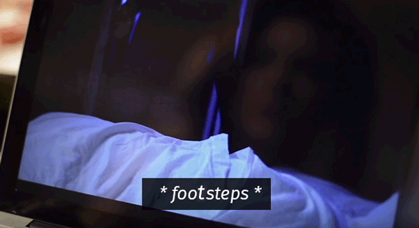
Add captions of high quality to your videos. The caption should be in sync with the spoken content, the people who are speaking should be identified when they speak and the important sounds should be included (i.e. footsteps approaching, doors opening, water boiler overheating).
- Make sure that the captions do not cover up important parts of the video.
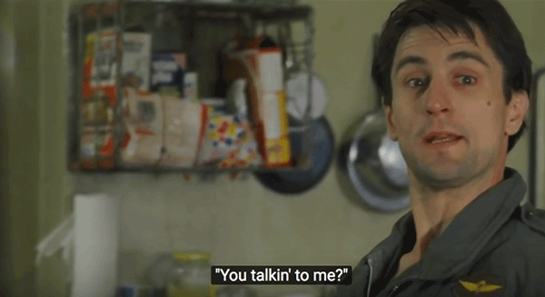
- Style your captions so that they are easy to read. A common mistake is using all caps white text on full black background. That is awfully difficult to read. The same principles as for normal text apply to captions. Use a highly readable typeface on an opaque background. If the text is floating, it might sometimes have a bad contrast with the background.

White text on off-black background. - Style sounds differently than spoken content. I.e. write your sounds in italic.

Italic text with asterisks to indicate sounds. - It is a good practice to add transcripts for video & audio. By doing so, everyone who prefers reading over watching will benefit from it.
Forms
Make sure that all elements can be accessed with the keyboard by using the tab-key. Make sure that the elements are in the right order. In our western world, the user expects content to be read from left to right, top to bottom.
- One field per line is easier to navigate than multiple fields on one line.
- Radio buttons should be able to traverse using the arrow keys. This is implemented by default when using the
fieldsettag. Here is an example of accessible radio buttons borrowed from WebAIM: - skip code example to next item
<fieldset>
  <legend>Choose a shipping method:</legend>
  <input id="overnight" type="radio" name="shipping" value="overnight">
  <label for="overnight">Overnight</label>

  <input id="twoday" type="radio" name="shipping" value="twoday">
  <label for="twoday">Two day</label>

  <input id="ground" type="radio" name="shipping" value="ground">
  <label for="ground">Ground</label>
</fieldset>
Visual output: - If there are many options, use a drop-down list. It can be selected by typing the first letters so make sure that the information at the start is not redundant. Elements should be selected as fast as possible. Here is an example via WebAIM:
- skip code example to next item
<label for="favcity">Choose your favorite city:</label>
<select id="favcity" name="select">
  <option value="1">Amsterdam</option>
  <option value="2">Berlin</option>
  <option value="3">Delhi</option>
  <option value="4">Hong Kong</option>
  <option value="5">London</option>
  <option value="6">New York</option>
  <option value="7">Sao Paulo</option>
  <option value="8">Tokyo</option>
</select>
Visual output: - If the form fails, display a summary of errors at the top of the form additionally to those inline. Only inline might fail silently as the user might not scroll/look down. Ideally errors in the summary are also linked to the respective fields, so that the user can quickly jump to them.
- There should not be any timeout when filling in forms or the like. If there has to be, then be generous with the time, be clear that there is a timer and what the consequences of running out will be.
Also have a look on forms for Visual, Low Vision & Color and Cognitive Accessibility.
Popups
Popups can be a nightmare, especially when they open easily (on hover or focus). They often break the reading flow and are hard to close (too small close button or not closable via keyboard). However, if done right, popups can add value to a page. I.e. giving more information without leaving the page.
- Popups should be easy to close and should only open if the user wants them to.
- If a popup is opened, the first thing that has focus should be the close button. Also, it is a good idea to “trap” the focus within its popup until closed. This mimics the normal behaviour and prevents the keyboard user from losing focus.
- The user should be able to close popups by hitting the
escbutton. - Hugo Giraudel did quite a good job creating an accessible popup for edenspiekermann_.
Navigation & Menu
Complex navigation hurt everyones usability. Reduce your navigation to a minimum.
- You may style the focus outline the way you want but do not remove it. Avoid messing around with the
tabindex. All usable elements have to be accessible via keyboard. - Indicate the current position in your menu semantically and visually.
- Have clear hover & focus states on your interactive elements. Try doing more than just a simple color change.
- skip code example to next item
.interactive-element { color: blue; text-decoration: underline; } .interactive-element:hover, .interactive-element:focus { color: deepskyblue; text-decoration-style: double; } - All elements, including the drop-down should be accessible using just the keyboard.
- Using skip links as introduced in visual accessibility is a good practice. That way users do not have to traverse a lot of elements, but can jump immediately to specific sections. If you have them visually hidden, reveal them on focus. You can try it out by traversing this example using the tab key.
- skip code example to next item
// Script to unhide Skiplinks on focus var skiplinks = document.querySelectorAll('a.visuallyhidden'); for (var i = 0; i < skiplinks.length; i++) { var el = skiplinks[i]; el.addEventListener('focus', function() { el.classList.remove('visuallyhidden'); }); el.addEventListener('blur', function() { el.classList.add('visuallyhidden'); }); } - skip code example to next item
<p>Item</p> <a href="#linkNext" class="visuallyhidden">Jump to wanted link</a> <p>Annoying content</p> <a href="#link">Annoying Link</a> <p id="linkNext">Next item</p> <a href="#link">Wanted Link</p> - It is a good practice to have a table of content linking to each heading within a long text.
Drop Downs
If possible, try to reduce the complexity of your navigation before implementing drop downs.
- Usually Submenus are individual lists
ulorol, nested in the parents list itemli. - Drop downs should stay dropped down once activated or have a tolerance for a wavering mouse. This prevents the menu from unintentionally closing when used by people with reduced dexterity. The same holds true for all appearing/disappearing elements. On this website an easy CSS technique was used to show/hide the link anchors with a delay. Here is a simplified example:
- skip code example to next item
/* * 1. the second number is the animations delay */ .anchor { opacity: 0; transition: opacity 0.5s 0.5s; /* 1. */ } /* * 1. overwrite the delay and show it immediately * if the element is not hovered (thus on blur) * the rule above takes effect and add a delay */ .anchor--li:hover .anchor, .anchor--li:focus .anchor { opacity: 1; transition: opacity 0.5s; /* 1. */ } - do not open the submenu as soon as the focus enters the top-level menu item. A keyboard-only user does not want to step through all the submenu links to get to the next top-level item. One way would be that the top level is actually not a link, but just a toggling button. If this top level item should remain a link to a page you can delay the drop down on focus so that the user would be able to quickly fly over it. Then, however, the user will have to wait some time before seeing the subnav when he actually wants to open it. Another solution is to be able to navigate through the menu using the arrow keys. Left and right to navigate the top buttons, down and up to access the sub-links. That is quite tricky to code and some users might not understand it. The easiest and probably best solution is to add a separate “show submenu” button (i.e. an arrowhead) that is accessible and will toggle the submenu. Here is an example:
- skip code example to next item
var menuItems = document.querySelectorAll('.exampleButton'); for(var i = 0; i < menuItems.length; i++) { menuItems[i].addEventListener('click', function(e){ var button = this; var buttonText = button.querySelector('.visuallyhidden'); var subMenu = button.parentNode.querySelector('.example-submenu'); if (!button.classList.contains('open')) { button.classList.add('open'); buttonText.innerText = 'hide submenu'; subMenu.classList.remove('hidden'); subMenu.removeAttribute('aria-hidden'); // sadly we have to set the focus on the first link element, // otherwise screenreader do not notice the change subMenu.querySelector('a').focus(); } else { button.classList.remove('open'); buttonText.innerText = 'show submenu'; subMenu.classList.add('hidden'); subMenu.setAttribute('aria-hidden', 'true'); } }); } - skip code example to next item
<nav id="exampleNav2" role="navigation" aria-labelledby="exampleNav2title">
  <h2 id="exampleNav2title">Example Accessible Navigation</h2>
  <ul>
    <li><a href="#link">Section1</a></li>
    <li>
      <a href="#link">Section2</a>
      <button class="exampleButton">
        <span class="visuallyhidden">show submenu</span>
      </button>
      <ul class="example-submenu hidden" aria-hidden="true">
        <li><a href="#link">Section2-1</a></li>
        <li><a href="#link">Section2-2</a></li>
      </ul>
    </li>
    <li><a href="#link">Section3</a></li>
  </ul>
</nav>
Visual output:
Scrolling
Horizontal Scrolling is a challenge for most users and becomes an even greater pain for people with unsteady hands. Moreover, some modern browser hide the scrollbar which makes it even more difficult.
- In general, users ignore horizontal scrolling even if there are arrows. Also, the more to the right the content is, the less it will be seen. If you still use horizontal scroll, always indicate how many items are hidden.
- Also, vertical scrolling is not always obvious. I.e. when having a full height header image, a lot of users do not notice that they can actually scroll. So, provide a visual hint.
Testing & resources
Found an error or have an addition? Please contribute to this project via github.
- Actually, no useful automatic testing tools were found. Luckily, testing for physical & audio disabilities is not a big deal:
1. Use your website with your keyboard only and see if every element is accessible.
2. Simulate an unsteady cursor by slightly shaking your mouse while using your page. See if everything is still easily usable (element sizes + appear/disappear)
3. Turn your audio off to check for audio issues. - References/Resources used to write this page: Accessibility Handbook, Vertical Challenge, Nielsen Norman Group, Webaim, WAI Tutorials, uxmovement and Reddit.
Open up the web for everyone!
Visual • Low Vision & Color • Physical & Audio • Cognitive
Selling Accessibility